

The power of Gatsby.js
As a software developer, we are used to thinking in abstractions. We filter details that are not relevant in a particular context and retain the essential information that is relevant in that context. The trick is to choose the right level of abstraction and thus reduce the complexity of a certain task at hand. In this blog our ‘task’ is adding responsive and progressive images loading functionality to websites. I was positively surprised by one of the great abstractions available in Gatsby.js, which makes it extremely easy to add responsive and progressive image loading functionality to websites through the gatsby image component.
By: Christiaan Rudolfs | PanCompany
In this blog post I’ll demonstrate how to use responsive and progressive image loading in Gatsby and verify gatsby-image’s slogan: “Speedy, optimized images without the work.”.
Gatsby is an open source framework based on React and powered by GraphQL for creating websites and apps. It’s a Static Site Generator (SSG) that can be used as the presentation layer for a headless Content Management System (CMS) or standalone (without a CMS). Blogs, e-commerce, lead generation, portfolio and corporate websites are all suitable use cases for Gatsby.
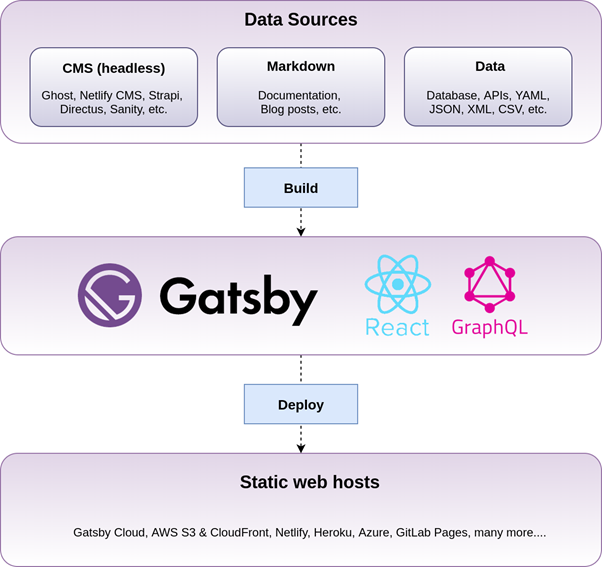
Websites created with Gatsby are super fast, extremely secure and based on a popular technology stack. Some example websites built with Gatsby are: reactjs.org, airbnb.io, airbnb.design/cereal, justdoit.nike.com, ca.braun.com/en-ca, bitcoin.com and spotify.design. These websites all leverage the ease of React components and the dynamics of GraphQL to generate highly performant websites. As we’ll see next, GraphQL also plays an important role in image optimization within Gatsby.
Page and image loading times can make or break a website’s user experience. There are several practical case studies mentioned by WPO stats that demonstrate the impact of web performance optimization (WPO) on user experience.
Gatsby has built-in support for responsive and progressive image technologies. Responsive images work well on devices with widely differing screen sizes and resolutions. It uses resolution switching to display identical images with different sizes or resolutions and art direction to display different images to suit different display sizes. Progressive images are lazy loaded with a low resolution using a blur-up technique or traced placeholder SVG to speed up initial page load and save bandwidth.
Let’s find out how these image technologies can be implemented in Gatsby by leveraging gatsby-image.
All code used in this blog can be found in my GitHub repository.
I assume that you’ve already installed a (recent) version of Node. If not, make sure you do. I’m using Node Version Manager (NVM) and currently Node 15.5.1 is selected. Next we need to install Gatsby:
Verify the installation:

Create a new Gatsby project:

Start the new project:
Open http://localhost:8000 to see the Gatsby default starter website.
Now we’re ready to see gatsby-image in action!
The gatsby-image plugin utilizes two other components: gatsby-plugin-sharp and gatsby-transformer-sharp. The former uses the Sharp image processing library and is responsible for performing the actual image magic such as reducing image size with minimal loss of image quality. The latter is responsible for performing image resizing and cropping functions to create responsive images.
Note: try to delete the .cache folder within your project when changes to images are not correctly reflected within your application.
Our project is already initialized with the necessary plugins as seen in gatsby-config.js:
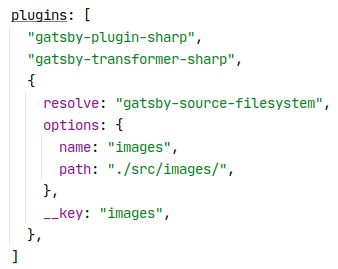
The gatsby-source-filesystem plugin is required to source the images from the local filesystem into our application.
Now let’s find a nice photo from Pexels that we can use to demonstrate image optimization in Gatsby. I choose the large version of this image from Oliver Sjöström and copy it to our src/images folder. Next we’ll create the following sample page (src/pages/image-optimization.js) that will act as a parent container for the images to be displayed:
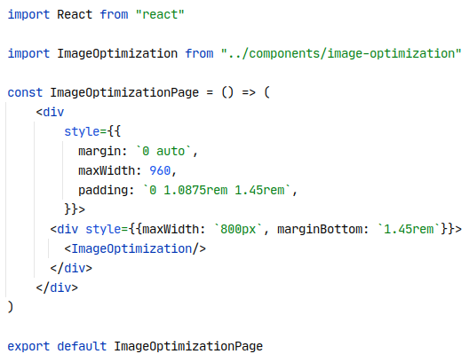
Then we’ll create a sample ImageOptimization component (src/components/image-optimization.js) as follows:
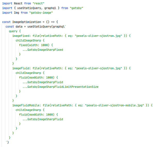
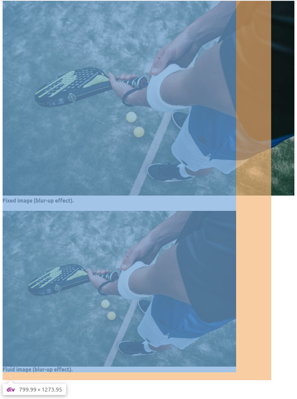
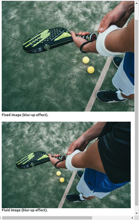
Our source image pexels-oliver-sjostrom.jpg has a resolution of 1920 x 1280 pixels. As we can see, all images in our web page are converted to smaller images with a width of 1000 pixels. The fixed image is always displayed with an absolute width of 1000 pixels, whereas the fluid image takes the width of its parent (div) which is 800 pixels in this case.
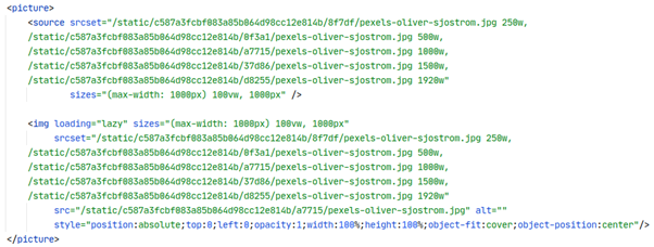
The imageFixed graphql query generates images with the specified width of 1000 pixels and additionally it tries to generate higher resolution images with widths of 1500 pixels and 2000 pixels (respectively 150% and 200% of the specified width). In our case the 2000 pixels width image will not be generated because the source image only has 1920 pixels available.
The imageFluid graphql query generates images of 25%, 50%, 100%, 150% and 200% of the specified maxWidth (which is 1000 pixels in our code). Also in this case the 2000 pixels width will not be generated.
The responsive HTML for each image is contained within a gatsby-image-wrapper container (div). For the fluid image the responsive HTML (explained in resolution switching) looks as follows:
When resizing the browser window, we can see that the fixed image remains the same width whereas the fluid image resizes to a smaller image (therefore being responsive).
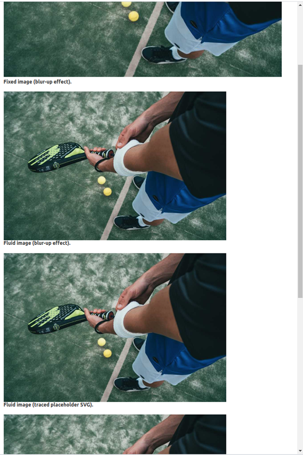
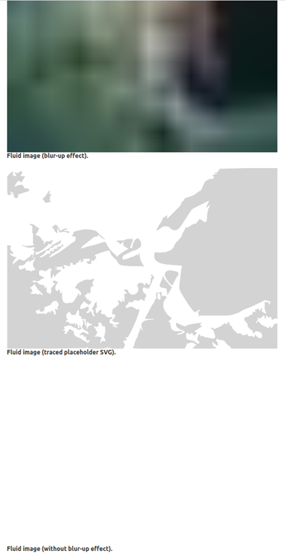
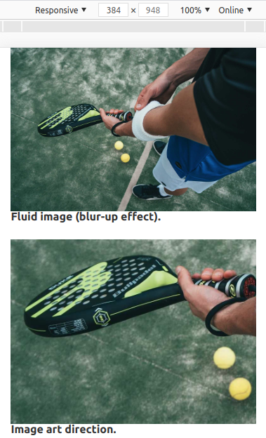
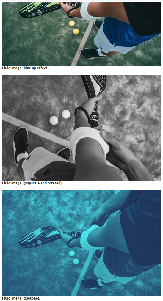
Gatsby has built-in support for progressive image loading and uses a blur-up effect (default) or traced placeholder SVG to show a preview of the image while it loads. This way users will see the whole image partially loaded instead of seeing half of an image fully loaded.
The screenshot below shows how it looks like when the images are partially loaded (but displayed as a whole). Note that the third image uses no effect. You can see this effect when refreshing the image-optimization page.
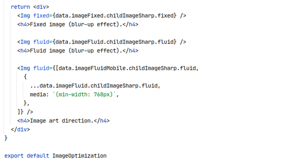
While resolution switching loads different sizes of the same image, art direction loads completely different images depending on the display size. Art direction can be applied by providing an array of fixed or fluid images along with a media key per image to gatsby-image’s fixed or fluid props, e.g. as follows:
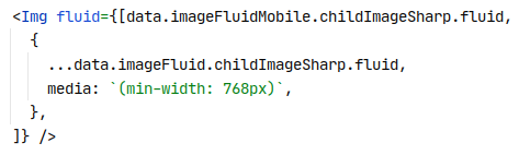
In this example we’ve specified that the image pexels-oliver-sjostrom.jpg (retrieved by the imageFluid query) should be displayed when the viewport’s width is 768 pixels or more, otherwise the image pexels-oliver-sjostrom-mobile.jpg (retrieved by the imageFluidMobile query) should be displayed. In this way, a smaller image is shown on mobile devices that zooms in on the padel racket:
The gatsby-plugin-sharp plugin supports many additional options for transforming images. Three of these options (that can be found in our code example) are grayscale, rotate and duotone:
The power of Gatsby has been demonstrated by showcasing its impressive image optimization capabilities. Gatsby offers clearly defined React components leveraging GraphQL and Sharp under the hood, making adding responsive and progressive images to a website a breeze. Gatsby-image’s slogan validated! All code in this post can be found in my GitHub repository.
Read more articles like this on PanCompany.com/blog

